Monday, 15 December 2014

Front Cover: First Draft


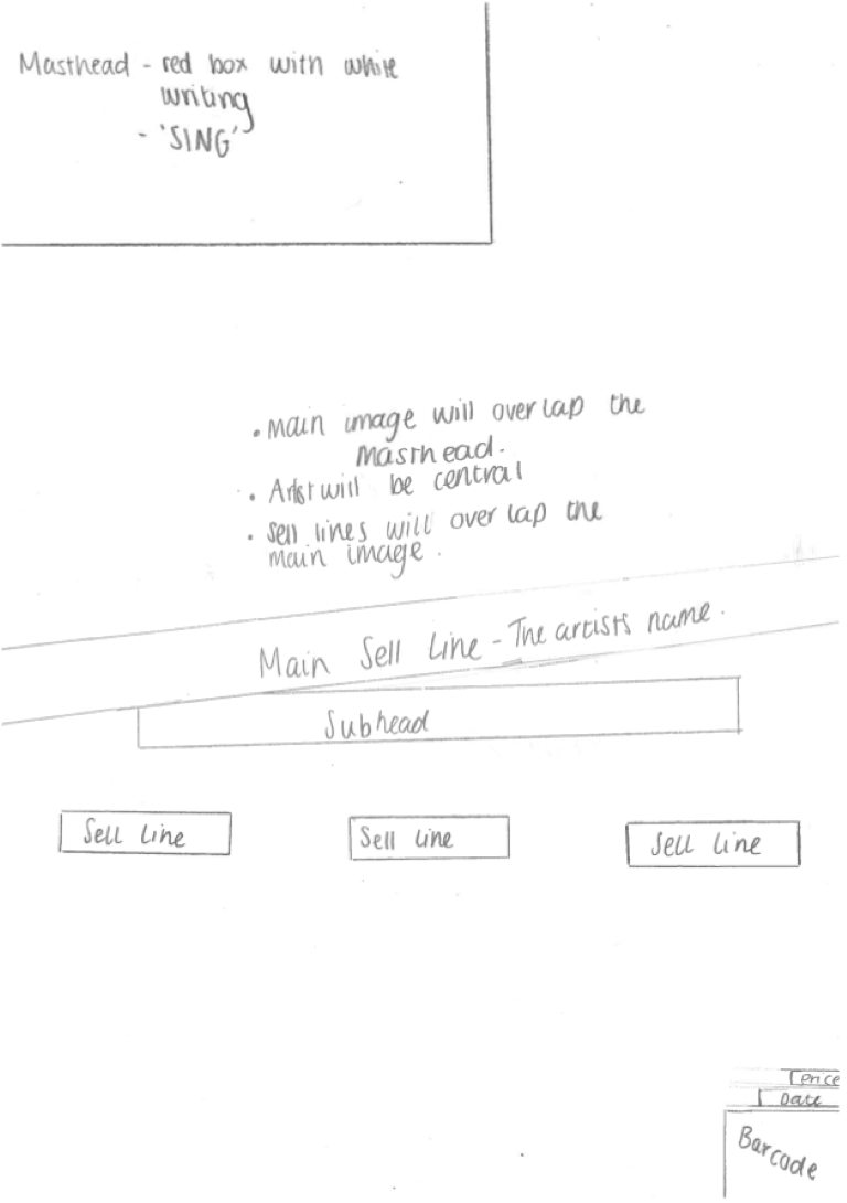
This is the first draft of the front cover of my magazine. I tried to stick to the flat plan that I created for my front cover when making this draft.

When making my first draft I had an idea of what I wanted my front cover to look like. For my front cover I took inspiration from NME magazine, I like the setup of their front covers and the style of their masthead.


I was given feedback on my first draft of my front cover from my teacher. My teacher said that I had too much spare white space, so in order to make this better I will have to re-arrange the page to make it look more full and have less 'spare' space. My teacher also told me that they couldn't really see the main sell line and the sell lines on top of the pictures, so I will either move these things to a different location when I make my second draft or I will add in a box behind the writing so you can read the text better.

Monday, 8 December 2014

Photo Shoot Consent Form

I asked my model to sign a consent form to confirm that I could take photos of there and use them in my magazine.

Photoshoot Planning


What personnel do you need? Who are you going to photograph?
I won't need a lot of people for my photoshoot, I will realistically only need the model and myself to take the photos. I will also be using a friend as a model as I think that they will fit the look that I am trying to create for my magazine.

What props will you need?
I don't think that I will need any props for my photo shoot as I want my photos to be quite simple. I just want my main focus of the shots to be the model.

How are you going to emphasise color?
I am going to be using a plain white backdrop so I will have the model dressed in quite dark colors, e.g. black and grey, to contrast against the background. I don't want too much color in my photos as I want my masthead to stand out on my front cover and I think if I have too much color in my images it will take away from my masthead.

Have you briefed your personnel/models?
I have told my model how I want them to dress and how I want their hair and make-up to be so we don't have to waste shoot time getting them ready and looking the way that I want them to for the pictures.

What lighting will you need? Any other equipment?
I want to have high key lighting on my photos, so I will either need to have big lights, a lot of lights in order to create this affect.

Where will you shoot? Will you need a backdrop?
Where I am planning to shoot my pictures there is a plain white backdrop, this is what I wanted for my pictures so I won't need to take anything with me or use a green screen in order to make a backdrop. 

Make-up? Costume?
I want my mode to wear simple clothes, e.g. a leather jacket and plain top, as I don't want there to be too many colours on my front cover as I am sticking to a three colour, colour scene. As for the makeup I again want my model to have a simple style, as I want them to look quite natural, however I do want them to have a bright coloured lipstick as I want at least some colour to stand out on her.

Monday, 24 November 2014

Time Management

At the start of the course I found it difficult to divide my time equally between my tasks for media and my other subjects. I started to set aside some time each night to try and do some media work, which was mainly research on music magazines. I did this as I didn't want to fall behind on my work as I know if you fall behind it is very difficult to catch up. However I didn't always stick to this plan and I sometimes didn't get the tasks that I wanted finished by a certain time finished.

As I have progressed through the course I now have a more solid time management plan and I don't worry as much as I did before about getting tasks finished in time as I know that I will get the finished if I stick to my plan. Since I have stuck to this plan I have caught up on the work that I fell behind on when I didn't stick to my time management plan.


Monday, 17 November 2014

Front Cover Flatplan


This is the final flat plan that I have created for the front cover of my music magazine. I have looked at a lot of other music magazines and I decided which of the conventions and features I would like to try and incorporate, but change to make my own, into my magazine. 

The main magazine that I took inspiration from for my front cover is NME. I really like the style of NME magazines, but I don't want to make a copy of NME so I will only take inspiration from some conventions and work them into the magazine.

I am going to be sticking to a three color, color scheme on my front cover and I will try to incorporate this throughout the magazine

Thursday, 13 November 2014

Generic Conventions

  • The masthead is to the top left of the page, I will do this on my magazine because when the magazine is on the shelf readers will recognize it and be more likely to buy it. As the masthead is the most recognizable thing about a magazine front cover I will want it to be seen on the shelf.
  • The essential information is very small on the page, it doesn't take up too much room. I will put the barcode in the bottom right hand corner of my contents page as it isn't too important to the cover, I will also put the date and the price in a small font under the masthead because, like the barcode, they aren't too important to the cover.
  • This issue of NME hasn't  used boxes behind the sell lines etc. but they have done in the past. I will be using boxes on my front cover as it will make it easier to read my sell lines. 
  • on this front cover they have a main image of the Arctic Monkeys, as they are a band they have a group shot as the main image, not just the front man. For my magazine i will be using a solo image.
  • This contents page has made the contents section of the page quite small and made the images more of the feature on the page, whereas I will be making my contents bigger, but I will be using a similar style to this.
  • This magazine has used a 'band index' but for my magazine I will be using the UK top ten at that time. 
  • I will be using more than one image on my contents page instead of one as I think it makes the page look too plain.

  • This double page spread has used a red letter behind the text, I will be doing this on my double page spread but I will change the opacity so it isn't as bold and so you can read the article better.
  • This double page spread has used an image in black and white to fill the left side of the double page spread. the black and white of the image contrasts against the red used on the right side of the page. I will try to do something similar in my magazines double page spread as I like the look that it has and I think that it will fit with they style of my magazine.
  • This double page spread has used drop caps within the article, I will do the same on my magazine as it is quite a generic convention.