Monday, 15 December 2014

Front Cover: First Draft


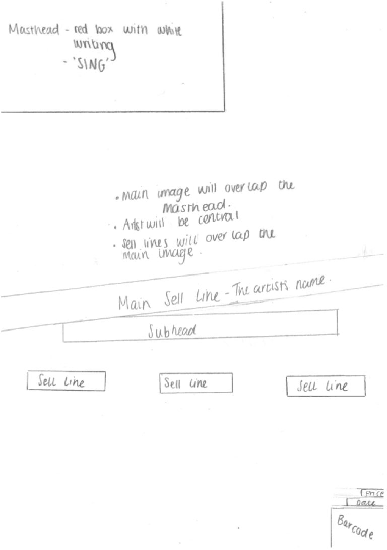
This is the first draft of the front cover of my magazine. I tried to stick to the flat plan that I created for my front cover when making this draft.

When making my first draft I had an idea of what I wanted my front cover to look like. For my front cover I took inspiration from NME magazine, I like the setup of their front covers and the style of their masthead.


I was given feedback on my first draft of my front cover from my teacher. My teacher said that I had too much spare white space, so in order to make this better I will have to re-arrange the page to make it look more full and have less 'spare' space. My teacher also told me that they couldn't really see the main sell line and the sell lines on top of the pictures, so I will either move these things to a different location when I make my second draft or I will add in a box behind the writing so you can read the text better.

Monday, 8 December 2014

Photo Shoot Consent Form

I asked my model to sign a consent form to confirm that I could take photos of there and use them in my magazine.

Photoshoot Planning


What personnel do you need? Who are you going to photograph?
I won't need a lot of people for my photoshoot, I will realistically only need the model and myself to take the photos. I will also be using a friend as a model as I think that they will fit the look that I am trying to create for my magazine.

What props will you need?
I don't think that I will need any props for my photo shoot as I want my photos to be quite simple. I just want my main focus of the shots to be the model.

How are you going to emphasise color?
I am going to be using a plain white backdrop so I will have the model dressed in quite dark colors, e.g. black and grey, to contrast against the background. I don't want too much color in my photos as I want my masthead to stand out on my front cover and I think if I have too much color in my images it will take away from my masthead.

Have you briefed your personnel/models?
I have told my model how I want them to dress and how I want their hair and make-up to be so we don't have to waste shoot time getting them ready and looking the way that I want them to for the pictures.

What lighting will you need? Any other equipment?
I want to have high key lighting on my photos, so I will either need to have big lights, a lot of lights in order to create this affect.

Where will you shoot? Will you need a backdrop?
Where I am planning to shoot my pictures there is a plain white backdrop, this is what I wanted for my pictures so I won't need to take anything with me or use a green screen in order to make a backdrop. 

Make-up? Costume?
I want my mode to wear simple clothes, e.g. a leather jacket and plain top, as I don't want there to be too many colours on my front cover as I am sticking to a three colour, colour scene. As for the makeup I again want my model to have a simple style, as I want them to look quite natural, however I do want them to have a bright coloured lipstick as I want at least some colour to stand out on her.

Monday, 24 November 2014

Time Management

At the start of the course I found it difficult to divide my time equally between my tasks for media and my other subjects. I started to set aside some time each night to try and do some media work, which was mainly research on music magazines. I did this as I didn't want to fall behind on my work as I know if you fall behind it is very difficult to catch up. However I didn't always stick to this plan and I sometimes didn't get the tasks that I wanted finished by a certain time finished.

As I have progressed through the course I now have a more solid time management plan and I don't worry as much as I did before about getting tasks finished in time as I know that I will get the finished if I stick to my plan. Since I have stuck to this plan I have caught up on the work that I fell behind on when I didn't stick to my time management plan.


Monday, 17 November 2014

Front Cover Flatplan


This is the final flat plan that I have created for the front cover of my music magazine. I have looked at a lot of other music magazines and I decided which of the conventions and features I would like to try and incorporate, but change to make my own, into my magazine. 

The main magazine that I took inspiration from for my front cover is NME. I really like the style of NME magazines, but I don't want to make a copy of NME so I will only take inspiration from some conventions and work them into the magazine.

I am going to be sticking to a three color, color scheme on my front cover and I will try to incorporate this throughout the magazine

Thursday, 13 November 2014

Generic Conventions

  • The masthead is to the top left of the page, I will do this on my magazine because when the magazine is on the shelf readers will recognize it and be more likely to buy it. As the masthead is the most recognizable thing about a magazine front cover I will want it to be seen on the shelf.
  • The essential information is very small on the page, it doesn't take up too much room. I will put the barcode in the bottom right hand corner of my contents page as it isn't too important to the cover, I will also put the date and the price in a small font under the masthead because, like the barcode, they aren't too important to the cover.
  • This issue of NME hasn't  used boxes behind the sell lines etc. but they have done in the past. I will be using boxes on my front cover as it will make it easier to read my sell lines. 
  • on this front cover they have a main image of the Arctic Monkeys, as they are a band they have a group shot as the main image, not just the front man. For my magazine i will be using a solo image.
  • This contents page has made the contents section of the page quite small and made the images more of the feature on the page, whereas I will be making my contents bigger, but I will be using a similar style to this.
  • This magazine has used a 'band index' but for my magazine I will be using the UK top ten at that time. 
  • I will be using more than one image on my contents page instead of one as I think it makes the page look too plain.

  • This double page spread has used a red letter behind the text, I will be doing this on my double page spread but I will change the opacity so it isn't as bold and so you can read the article better.
  • This double page spread has used an image in black and white to fill the left side of the double page spread. the black and white of the image contrasts against the red used on the right side of the page. I will try to do something similar in my magazines double page spread as I like the look that it has and I think that it will fit with they style of my magazine.
  • This double page spread has used drop caps within the article, I will do the same on my magazine as it is quite a generic convention.


Wednesday, 12 November 2014

Survey Analysis

These are the results that I received on my survey that I previously posted a link to (https://www.surveymonkey.com/s/SX9BCTN).

The results that I got will help me when I am making my magazine as I can look at the responses that my target age group gave me and cater the magazine to their likes, but still in keeping with the theme that I have decided to go for.
The first question that I asked was 'What is your gender?'. I thought that this would be a useful question for  me to ask so I can see what people of certain genders prefer from music magazines, and so I can cater my magazine to their likes.
I asked the people what age group they belonged in so I know what, out of the people I have asked which are in my target age group, prefer out of a music magazine.
After asking about gender and age I thought that it was crucial to ask about what genre of music the people I asked preferred. I found out that the two most popular genres were Pop and Acoustic. I now know that if I want my magazine to be as popular as possible with my target age group then I will need to have Pop and Acoustic as my feature genres.
One of the features that I want to have in my magazine is a section which reviews and talks about gigs and converts. So I asked this question to find out if my target group actually like going to concerts and gigs themselves; I did this so I would know whether or not this section would appeal to them. I got mixed responses from this question, but overall I found that people do enjoy going to concerts and gigs, so I now know that it is a good idea to keep this section in my magazine.
I also want to have a section in my magazine which is on the UK music charts. So I asked this question so I could see whether or not my target group like listening to the music charts. I found that everyone that answered my survey either listens to the music charts, so I now know that I should include this feature.
I asked this question so I knew whether or not to make my magazine weekly or monthly, also I thought if I asked this question it would help me to decide on an appropriate price for the magazine.
I asked this question because I wanted to know how much my target group would be willing to pay for my magazine.
I asked this question so I know when I am talking about the UK music charts whether or not I should talk about things like the iTunes charts or not. I now know when I include my music chart feature I should look at the weekly charts on iTunes as the majority of the people who answered preferred to download music.
I asked this question because I wanted to know whether or to my target group liked to buy magazines and whether or not they would want to buy my music magazine. 

The 'Recce'

1.    Are there any potential hazards that could pose a health and safety risk where your photo shoot will take place (trailing cables/traffic/other objects )?

When I take my photos I will be taking them in a photography studio so there may be cables from lights ect. that may cause hazards as people may trip over them and either hurt themselves or break the lights. Also if I decide to use any props in my photos they will be in the studio so people may also do the same with them and trip over them and potentially break them or hurt themselves.

2.    What will you do to ensure these risks are minimised?

When taking the photos I wont have too many people in the studio so I will be able to see where everyone is and make sure thet theu dont trip or break anything. I will also be careful when setting up the studio so it is tidy and there wont be anything where there shouldn't be so it minimises the chances of poeple tripping over things.

3.    Will the time of day/weather affect the outcome of the photos? Have you allowed for this?

As I am planning on taking my photos in a studio the time of day or the weather shouldn't really affect the outcome of the photos. However if I dont get the chance to use the studio I will have to take my photos around midday when it is light outside so the photos arent dull and so they have enough light from the natural outdoor light.

4.    Have you considered the background to your photos, particularly if taken outside? How will you ensure you will get the background you want?

For my photos I know that I want to have a plain white background as I think that this will suit the style that I want my magazine to have. I know that if I use the studio the background will be a plain white, but if I don't have the studio I will have to find a substitute area that I can use with a plain whit background, such as a plain white wall.


5.    Have you considered lighting? What about the ‘problems’ of natural lighting, either outside, or streaming through a window? Will you need to use a flash? Have you considered reflective objects that might spoil the effect?

If I use the studio I know that won't have to worry about natural lighting as I know that the lighting used in the is artificial. But if I have to use another location I will have to think carefully about the time of day and the weather when taking my photos as I know that those things will affect the outcome of the photos. If the day when I decide to take my photos is a particularly dull day I will have to use the flash on the camera as I do want my photos to be well lit. Another thing I will have to consider when I choose my location to take my photos is whether there is anything that might shadow or reflect on the model.


6.    Do you need permission to take photos in the place/venue you have in mind?

My original choice of location is in a photography studio at St.Peters university which is next to my college. In order to book the studio I will have to email the lecturer in charge of the studio and see when there are any days when the studio is free.


7.    Do you need to book time in a room (eg the photography studio at Shiney)?

When I email the lecturer I will ask when the studio will be free and I will ask them when it will be possible for me to come and take my photos. I will have to make sure that none of the dates that are free clash with any of my other lessons.


8.    Are other people/crowds likely to be an issue for you? What have you done to ensure that it will not spoil the effect?

If I get a spot in the studio I will make sure that only people that only the people need to be in the room are in the room. Because of the background that I want my pictures to have I won't have to worry abut other people being in the background and disrupting the image. 

9.    Are you reliant on lifts/props/friends’ equipment/models? How have you planned that these things will come together at the appointed time? Plan B?


I have two choices of which camera I will use to take my photos as I have my own good quality camera, but I also know that if something happens to that there will be others which I can borrow from the college which are also of a good quality. I have to try and schedule when I book the studio around my models college timetable as well so I definitely know that they will be available, however if something does happen so this model and they cannot do it then I have another person that I can use. I have also got another studio that I could consider using at the Bede campus if I cannot get a spot at the university.


10.  Finally, have you thought of every eventuality?

I think that I have considered every aspect that could possibly go wrong and I have thought of ways that I could get around it, and still have my photos of a good quality and so they're appropriate for the magazine.

Monday, 3 November 2014

Preliminary Task: Review


This is the front cover and contents page that I created for my preliminary task. For my preliminary task I was asked to make a front cover and contents page for a college magazine. I think all together my preliminary task turned out quite well, I like the layout of the pages however I think there are things that I could do better.

When making the front cover I stuck to most of my flat plan. I like the way that the masthead looks and where it is positioned, so if I were to remake this front cover I would probably do something similar if not the same for the masthead. I think that the main image that I have have used is appropriate for the target audience and purpose, the model in my main image is setting a good example as she is following college rules by wearing her lanyard and she is enjoying her work.
I think that I have chosen good sell lines as I think that they're things that college students would be interested in, however I think I could have made them slightly more interesting and I could have made them stand out on the page more. I also think that I could have made the main sell line stand out more as that is the thing that I want to catch my readers eye, but I think at the minute it blends in with the rest of the sell lines.
I think that I could have made the competition slightly bigger and more prominent on the page, and I could have also made the essential information (barcode and date) a bit smaller.

When I was creating my contents page I also roughly stuck to my flat plan. I like how I placed the masthead from the front cover smaller on this page and where I placed the date as I think that by doing this it helps the magazine tie together more and look better. I like the composition of this page however I think that it does look a bit plain as there is a lot of white space and not a log of color, so if I were to recreate this page I would have less white space and use more color without making the page look too busy.
With the images that I have included on this page I think that I could have used more models and have a bit more versatility within them as they are all vey similar.
I like how I have linked the images to certain articles within the magazine, however I think that I could include more articles as if I only have 19 or 20 articles then the magazine would be very thin and that will then lead for it to look uninteresting. So if I were to do this again then I would decrease the font size and make some more space to include more articles.

Overall I found this useful practice for making front covers and contents pages, as I have analyzed what I think I have and haven't done well. I now know what I need to  do in the future to improve my work.

Wednesday, 22 October 2014

Problems Sheet

This is a form that I filled in regarding my music magazine and any possible problems that might occur when making my music magazine. Whe filling out this form I looked at a variety of different things that might go wrong or not work for me during the process of making the magazine. When doing this I also looked at ways that I could solve the problems that may occur.

Preliminary Task: Flat Plans


I have created some flatplans for my preliminary task of a college magazine. For the preliminary task I have to create a front cover and contents page for a college magazine. 
I have created these flatplans so I have a rough idea of what I want my front cover and contents page to look like when I create it on photoshop.

When creating the front cover and contents page I might not exactly stick to the flat plans as my ideas that I have at the moment might not work well with the images that I take. I will be adapting the layout to make it look as good as possible.


Enrolment Task


As an enrolment task to media I was asked to write an essay describing what I would make a music magazine look like if I were to make one. This is the essay that I wrote for that task. Since writing this essay my ideas of what I would include in my music magazine have changed and. When I wrote this I didn't have as on depth knowledge as what I have now, so my work has developed a lot.

My teacher gave me some feedback on what I had and hadn't done well on this piece of work. I will use this feedback to improve my work in the future.


I also looked at at magazine from covers (the covers that I have put on this blog are the ones that I analyzed)  When I looked at these front covers I had no knowledge of music magazine front cover conventions, so the answers I gave for this section of the induction work are very basic.

I was also given feedback for this section of the task from my teacher, I will use this feedback to help me and my work in future tasks.

Thursday, 16 October 2014

Group Task: Analyzing Other Work


I have analyzed other peoples work on music magazines from previous years. I did this to get ideas for my own work so I can see what works well and what doesn't work as well. 
I did this as a group task so I could share ideas with other people. As I was looking at the work I had the mark scheme next to me so I could decide whether or not I thought the magazine met some of the requirements for certain grades.

When I was looking at the work I tried to see if I could tell what genre of music they were basing their magazine on, which I found very easily as it was very prominent within the magazine. 
I found that this piece of work had a very good and consistent colour scheme throughout, I think that this has been done well as you can tell that it is all supposed to be a part of the same magazine and it ties all of their work together, which a lot of people struggle to do.

When I was doing this task I was looking at the work to see if there were any elements that would help me to improve my magazine, this task also helped me see what conventions work best on different magazine genres.

It was very useful working with the mark scheme because I could look at it and see what people are looking for within my work. I know what to do in order to get my work to a certain grade.

Overall I found this task very useful.


Wednesday, 15 October 2014

Survey

I have created this survey so I can get an idea of what people want from a music magazine,  and so I can adapt my work to what people want.

Please answer all questions.

Monday, 13 October 2014

Preliminary Task: Front Cover and Contents Page


For my preliminary task I was asked to make a college magazines front cover and contents page. This is the front cover that I created for the college magazine, I hade this based on the flat plan that I created previously.

I have used a main sell line and sell lines that I thought would be appropriate for a college magazine. 
For the sell lines I used things that are appropriate and I thought students would like to read further into. Because I included sell lines that I think students would be interested in this makes it more likely that students will pick up a copy of the magazine.

Also on the front cover I included a competition to win an IPad, I did this because it again will intrigue students into reading the magazine. I knew that an IPad will be a suitable prize as students like to be up to date with technology, but they don't always like having to spend the money on buying the newest technology, so a chance to win a prize like this will be exciting for them.

When creating this front cover I applied the knowledge that I had learnt when looking at music magazine front covers. I looked at the conventions that had been used in music magazines and applied the ones that I thought would be appropriate for creating this college magazine.


When creating the contents page for the college magazine I applied the knowledge that I had previously learnt when looking at the conventions of a magazines contents page. I applied the conventions that I thought would be appropriate for the genre of the magazine that I was creating.

When creating my contents page I used some of the images that I had taken along the side as I thought if I didn't include any photos then the page would be boring and plain, I also inlcuded the corresponding page numbers for the pictures.

When creating the articles for the magazine I thought of things that a student might want to read and will be interested in. When doing this I also made sure that the pictures released to the article titles.

I included the date at the top of the page so the reader know which issue of the magazine this is. I also included a smaller version of the meathead, but this time I put it at the top right hand side of the page. I included the masthead so it ties the magazine together and so it doesn't look mismatched.


5 Seconds of Summer Double Page Spread Homework


This is the practice double page spread article that I made. I created this article before I had done any research into double page spread conventions. This will be useful for me to see how my work develops as my knowledge develops.


This is the feedback that I was given regarding the double page spread that I created. I will be using this feedback when it comes to making my music magazine double page spread as I think that it will be very useful and helpful for me.

Photoshop Practice And Evaluation


I have created a practice magazine front cover on photoshop. I have done this so I can test my skills on photoshop. I have used Photoshop quite a lot in the past so I did know how to use it when making this practice magazine front cover, however when I have been using Photoshop in the past I haven't made a magazine front cover, so this was good practice for me.

I found that the most useful tools that i used on photoshop was the magic wand tool, the text tool and the rectangle tool. As you can see you looking at my front cove that I have crated I used the rectangle tool to place rectangles behind the text so you can read what they say on top of the main image; so I found having the rectangle tool very helpful. I also found the magic wand tool very helpful when creating this as it helped me remove the majority of the white background of the main image and it helped me remove any shadows that there were on the original image. Obviously having the text tool was very helpful to me as text is one of the main component to the front cover of the magazine.

I think that the front cover that I have created looks a little like the front cover of an issue of NME magazine. I did use NME as an inspiration as I like the layout of their front covers and the simple colour scheme that they use. I like how this practice turned out, however if I were to do it again I would find away to make sure that all of the original background is removed without having to use the eraser, and I would possible add more colour, however I like the simple colour scheme that I have at the minute. Also if I were to re-make this front cover I would possibly include a tagline under the masthead, make the masthead bigger and make the main image a little smaller.

I like the positioning of the main image slightly over the masthead as I think that it makes the magazine look slightly more professionally made. The main image that I have used on this front cover was from the internet, so it had a white background, but when removing the white background, so you could see the masthead, I had some difficulty as not all of it would disappear. So next time when I make the front cover for my magazine I will have to try and find a way to get around this issue or fix it somehow.

Overall I quite like the style and layout of this practice front cover and I would like to make my music magazine front cover something similar to this. I also like the red, white and black colour scheme, so I may incorporate this into my front cover for my music magazine, however I am not 100% sure it fits with my genre.


Monday, 29 September 2014

Double Page Spread Deconstruction: The Vaccines


This is a double page spread from a music magazine featuring The Vaccines. In this post I am going to be deconstructing this double page spread and looking at the conventions of a double page spread. When I am doing this I will be looking to see if there are any particular conventions that this magazine has used that I would or would not like to use when it comes to making my own double page spread for my music magazine.

For this particular double page spread there is only one image, and that is of the main feature artist, The Vaccines. Most magazines tend to have one main image and other smaller images within the feature, I like how they have done this as in the image all of the band are looking into the camera, so it is like they are addressing you. So if there were more images on this page it would take away from this effect that the main image has given the reader. I might do something similar for my double page spread, but i don't think I will as I want to have more than one images on the page. I want to have multiple images (but not too many) of the artist that are appropriate to my article/interview but I don't want to just have one image on the page as I think it makes it look a bit bare, and it doesn't really stand out from the rest of the magazine.

There are three main colours used within this double page spread, these colours are blue, black and brown. These colours make the page look quite washed out, however the blue stands out against the rest. I think it looks better with a limited colour pallet as the page doesn't look too busy and the colours also reflect the genre of the band. However I think that this double page spread could have more colours on it as it does look washed out and plain. When making my double page spread I want the colours that I choose to reflect the artists genre, however I want them to be more prominent on the page as I do think the colours on this page look quite boring.

In this double page spread they have included drop caps within the paragraphs and pull quotes. These things are in the brightest colour on the page, blue. The drop caps stand out in this colour so the reader knows where to start reading and the pull quotes are used for the reader so it will make them more interested in the article and want to read it all. I might use drop caps on my double page spread as I want my magazine to be as easy to navigate as possible and I think it looks good on the page.
This double page spread has also used a pull quote from the article, they have put the pull quote in the same colour, blue, that they made the drop caps. Pull quotes stand out from the rest of the article and the readers eyes to directly towards it, therefor it is important to make the text in the pull quote interesting so it will make the reader want to read the rest of the article. I think when making my double page spread article I will use at least one pull quite as I think it is a good way to give the reader an insight into the article and I think it overall makes the page, mainly the text area, look more interesting.

On this double page spread they have put the text into columns, most articles in magazines have the minimum of three columns, however this magazine article only has two. When writing my article and designing the layout of my double page spread I will organise my text into columns, however I am not sure how many just yet.


This article has been written about The Vaccines through the point of view of someone else who knows them, the journalist hasn't interviewed the band. The style in which this has been written makes the article feel more formal. When I am writing my article I don't want it to feel as formal as this article as I do find this style quite boring, but I don't want it to be too informal either. I also want to include some form of article within my article as I think it makes it more interactive and fun to read.